Background
MyJio App was launched in 2016 with a focus on mobility services, and since then has grown into a super app with a diverse range of mini apps and features in it. With over 500 million users, it has become a crucial tool for Jio’s customers. However, the help and support section of the app needed a complete redesign to ensure that the users could easily access account-specific information based on their account type. To address this I had to completely revamp the help & support section, tailoring it to the specific needs of Mobility, JioFiber and Non-Jio users.
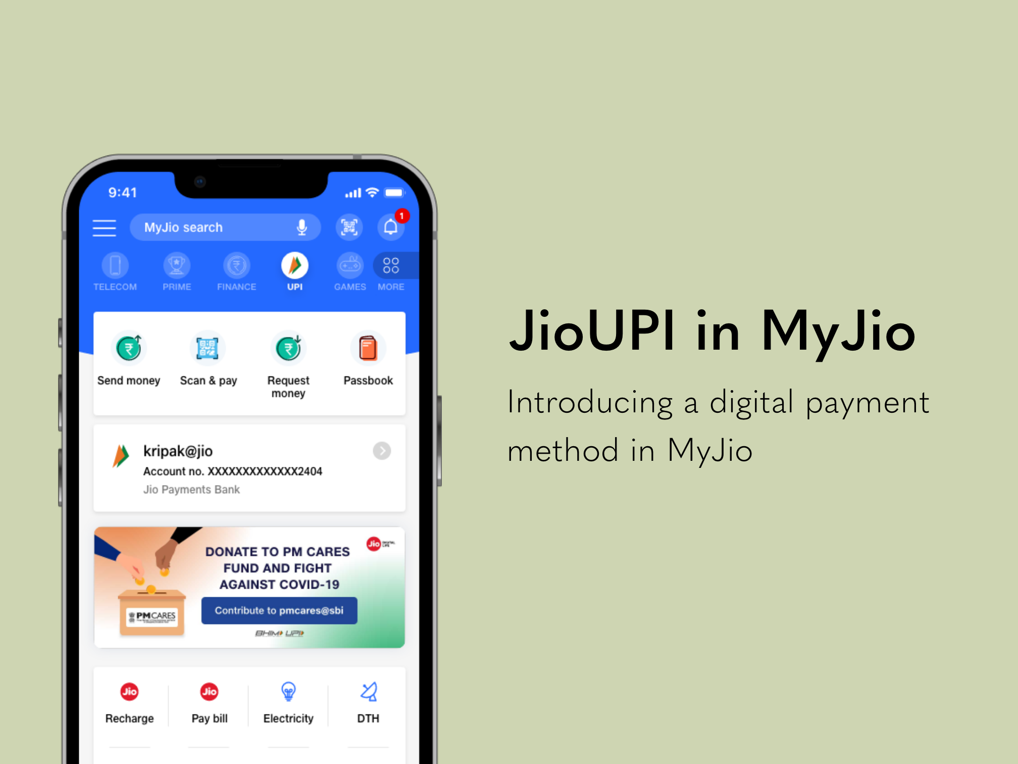
Final Designs

1-1

1-2

1-3

1-4
Results
The final result was a completely redesigned JioCare section that is more personalised and user-centric, providing targeted assistance to our users based on their specific account type. Overall the redesign has resulted in improved user satisfaction and a more streamlined experience for our users. Following 8 months into the launch –
The number of service requests generated has reduced by 16% since the redesign.
78% users said they found the new layout and organization of the JioCare section to be more intuitive and easy to use than the previous version.
Decrease in app abandonment rates, as users are now able to quickly find answers to their queries without becoming confused or frustrated.
Over 81% of users accessed the help and support section to troubleshoot issues related to their data plans or network connectivity which has led to fewer negative rating and complaints on Play Store and App Store for MyJio.
Design Approach
My approach to redesigning this feature revolved around three key considerations –
First, it was important to ensure every aspect, no matter how minor, was covered with no loose ends.
Second, I focused on context sensitivity, which means that the help and support information provided should be tailored to the user’s specific context, whether they are a mobile user, JioFiber user, or a non-Jio user.
Third, I made sure to maintain consistency in the user interface across all account types, so that the user can have a seamless and intuitive experience.
Building Empathy
To gain a better understanding of user needs and behaviours, I developed an empathy map and user personas for our diverse user base.

Empathy Map

User Personas
Information Architecture

What We Achieved
The end result was a completely redesigned JioCare section that achieved the following-
Improved User Experience: By tailoring the help & support section to the specific needs of each user type. We were able to provide a more personalized experience, making it easier for users to find the information they needed.
Reduced Customer Support Queries: With a more intuitive and user-friendly design, users were able to resolve queries on their own, resulting in less service requests raised.
Increased User Satisfaction: The redesigned JioCare section received positive feedback from users which lead to increased satisfaction and loyalty towards
This design was revamped with a focus on delivering a tailored experience for each account type. As a result, it now offers a user-friendly experience that effectively addresses the unique needs of different users.